

photo by Jack Lima, courtesy of www.prohockeynews.com
ARTHUR:
Anaheim calling to the hockey world…
Earlier this year, I heard that Timo Pielmeier had a new mask. It didn’t sound too special at first. He kept the ‘Stop’ sign over his neck from his old mask and replaced the German coat of arms with a Ducks crest. He then added two realistically-drawn ducks swimming in a fiery-orange, palm tree-infested sky on the sides of his face. A nice design, no doubt, but probably not as noteworthy as Jonas Hiller’s two-tone mask or Bryzgalov’s cartoon duck collage.
Then, of course, Sleek blogged from Conditioning Camp that the backplate of Pielmeier's mask was pretty noteworthy in and of itself. It's the old Mighty Ducks logo (but in black and orange) surrounded by the names of (I presume) members of his family with the quote "Ducks Fly Together" at the bottom.

photo by Jack Lima, courtesy of www.prohockeynews.com
Yeah… that's frikkin awesome. And I must second Sleek's sentiment:
Way to keep that tradition alive, dude.
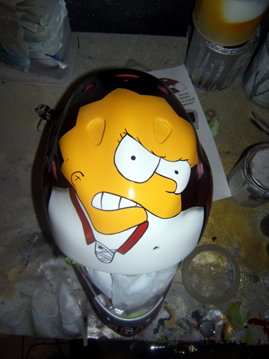
I'm still probably partial to the Shtalenkov mask, but if we're just talking about any Duck to blow through Anaheim with a customized mask, regardless of tenure, I have to give it to Gregg Naumenko, just for having the pretentious balls to put Ken Dryden (in cartoon poultry form) on the side of his face. I know what you're thinking, 'doesn't best use of a cartoon on a goalie's mask still go to Lisa Plenderleith of Colgate?' Yes, astute reader. Yes, it does.
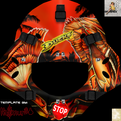
A digital rendering of the mask artwork after the jump…
From banshee (a user on thebreakaway.net). Awesome work. If you follow the link, he has also rendered the mask onto a helmet in multiple 3D angles.

via lh3.ggpht.com